弹性布局flex
注意点:
1.定义弹性布局(父级上定义)
2.设置了弹性布局之后,子元素的css中的float, clear, vertical-align 这些属性将失效。
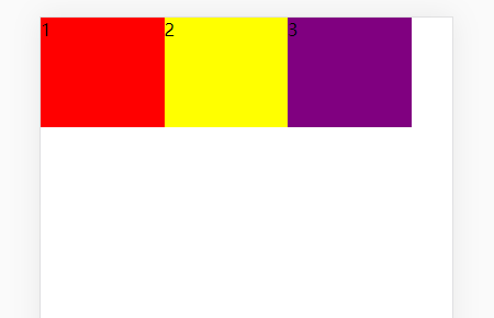
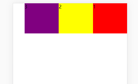
1、基本用法,设置父元素display: flex,
<div class="box">
    <div class="box1">1</div>
    <div class="box2">2</div>
    <div class="box3">3</div>
</div>
.box {
    width: 100%;
    height: 100%;
       /* 父元素 */
    display: flex;

    /* flex-direction:row; 默认属性 */
}

.box1 {
    width: 30%;
    height: 100px;
    background-color: red;
}

.box2 {
    width: 30%;
    height: 100px;
    background-color: yellow;
}

.box3 {
    width: 30%;
    height: 100px;
    background-color: purple;
}
效果图:
2、如果是需要它反着排列,此时就需要用到 flex-direction:row-reverse;(和我们的全部float:right;是一样的效果)
.box {
    width: 100%;
    height: 100%;
     /* 父元素 */
    display: flex;
    /* 反转属性 */
    flex-direction:row-reverse;
}
效果图:
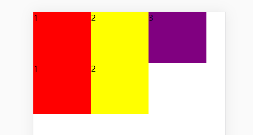
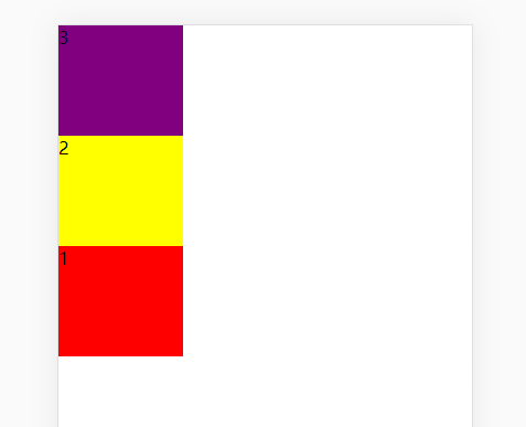
3、默认主轴是x轴,还可以按照y轴方向排列
.box {
    width: 100%;
    height: 100%;
      /* 父元素 */
    display: flex;
    /* y轴方向排列  column:纵队,列; 圆柱; 专栏;*/
   flex-direction:column;
}
效果图:
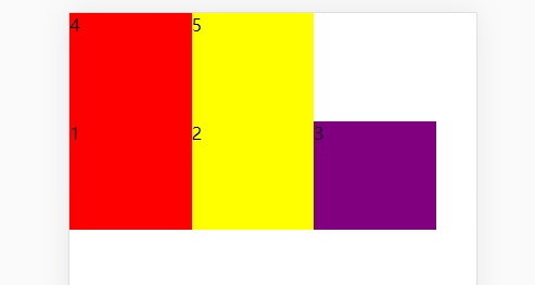
4、按照y轴方向反转排列
.box {
    width: 100%;
    height: 100%;
      /* 父元素 */
    display: flex;
    /* y轴方向反转排列  column-reverse*/
   flex-direction:column-reverse;
}
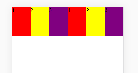
5、当弹性盒子里div较多时,默认强制在一行排列,此时盒子里div宽度不起作用,分别设置如下属性:
<div class="box">
    <div class="box1">1</div>
    <div class="box2">2</div>
    <div class="box3">3</div>
    <div class="box1">1</div>
    <div class="box2">2</div>
    <div class="box3">3</div>
</div>
.box {
    width: 100%;
    height: 100%;
      /* 父元素 */
    display: flex;
    /*  (不换行) */
    flex-wrap:nowrap;
    /* (换行) */
    flex-wrap:wrap;
    /* (倒序换行) */
    flex-wrap:wrap-reverse;
}
效果图分别如下: