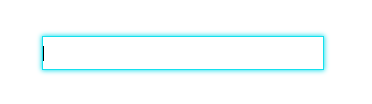
一、发光特效(基础)
input {
    width: 280px;
    height: 30px;
}
input {
	transition: all 0.3s ease-in-out;
	outline: none;
	border:  1px solid #ddd;
}
input:focus {
	box-shadow: 0 0 5px #14e0ee;
	border:  1px solid #14e0ee;
}
二、划线动态

<div>
  <input type="text" />
  <span></span>
</div>
div {
  position: relative;
  display: inline-block;
}
input {
  outline: none;
  border: none;
  background: #fafafa;
}
input ~ span {
  position: absolute;
  left: 0;
  right: 0;
  bottom: 0;
  height: 1px;
  background-color: #262626;
  transform: scaleX(0);
  transform-origin: right center;
  transition: transform 0.3s ease-in-out;
}

input:focus ~ span {
  transform: scaleX(1);
  transform-origin: left center;
}
三、动态边框

<div>
  <input type="text">
  <span class="bottom"></span>
  <span class="right"></span>
  <span class="top"></span>
  <span class="left"></span>
</div>
div {
  position: relative;
  display: inline-block;
  padding: 3px;
}
input {
  outline: none;
  border: none;
  background: #fafafa;
  padding: 3px;
}
.bottom,
.top,
.left,
.right {
  position: absolute;
  background-color: #262626;
  transition: transform 0.1s ease-in-out;
}
.bottom,
.top {
  left: 0;
  right: 0;
  height: 1px;
  transform: scaleX(0);
}

.left,
.right {
  top: 0;
  bottom: 0;
  width: 1px;
  transform: scaleY(0);
}
.bottom {
  bottom: 0;
  transform-origin: right center;
}
input:focus ~ .bottom {
  transform: scaleX(1);
  transform-origin: left center;
}

.top {
  top: 0;
  transform-origin: left center;
  transition-delay: 0.2s;
}
input:focus ~ .top {
  transform: scaleX(1);
  transform-origin: right center;
}

.right {
  transform-origin: top center;
  right: 0;
  transition-delay: 0.1s;
}
input:focus ~ .right {
  transform: scaleY(1);
  transform-origin: bottom center;
}

.left {
  left: 0;
  transform-origin: bottom center;
  transition-delay: 0.3s;
}
input:focus ~ .left {
  transform: scaleY(1);
  transform-origin: top center;
}
参考:
https://xin-tan.com/passages/2019-07-22-input-animation/#%E5%88%92%E7%BA%BF%E5%8A%A8%E6%80%81