一、background-clip设置
关键点:
- ` background-clip
设置成text` - 字体
color设置transparent -
background-image: 过渡设置
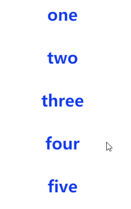
<div>
    <h1 class="one">one</h1>
    <h1 class="two">two</h1>
    <h1 class="three">three</h1>
    <h1 class="four">four</h1>
    <h1 class="five">five</h1>
<div>
div {
    display: flex;
    flex-direction: column;
    justify-content: center;
    align-items: center;
}
h1 {
    cursor: pointer;
    color: transparent;
    -webkit-background-clip: text;
    background-clip: text;
    background-repeat: no-repeat;
    transition: 0.5s ease-out;
}

.one {
    background-image: linear-gradient(to right, #f11111 45%, #123aeb 55%);
    background-size: 250% 100%;
    background-position: 100% 50%;
}
.one:hover {
    background-position: 0% 50%;
}

.two {
    background-image: linear-gradient(to bottom, #f11111 45%, #123aeb 55%);
    background-size: 100% 220%;
    background-position: 50% 100%;
}
.two:hover {
    background-position: 50% 0%;
}

.three {
    background-image: linear-gradient(to bottom, #f11111, #f11111), linear-gradient(to bottom, #123aeb, #123aeb);
    background-size: 0% 100%, 100% 100%;
    background-position: center;
}
.three:hover {
    background-size: 100% 100%, 100% 100%;
}

.four {
    background-image: linear-gradient(to bottom, #f11111, #f11111), linear-gradient(to bottom, #123aeb, #123aeb);
    background-size: 0% 100%, 100% 100%;
    background-position: center;
    background-position: 0% 50%, 50% 50%;
    transition: 0.5s background-size ease-out;
}
.four:hover {
    background-size: 100% 100%, 100% 100%;
    background-position: 100% 50%, 50% 50%;
}

.five {
    background-image: radial-gradient(closest-side, #f11111 50%, transparent 100%), linear-gradient(to bottom, #123aeb, #123aeb);
    background-size: 0% 0%, 100% 100%;
    background-position: 50% 50%, center;
}
.five:hover {
    background-size: 260% 260%, 100% 100%;
}
二、划线特效

关键点:
-
scaleX实现缩放,相比于设置width,会启用 GPU,避免重绘。 -
transform-origin属性来修改动画方向
<span>划线特效</span>
span {
    color: #000;
    position: relative;
    padding: 2px;
}
span::before,
span::after {
    content: "";
    left: 0;
    right: 0;
    height: 2px;
    background: #e8520b;
    transform: scaleX(0);
    transition: transform 0.2s ease-in-out;
}
span::before {
    top: 0;
    transform-origin: center right;
}
span::after {
  bottom: 0;
  transform-origin: center left;
}
span:hover {
  cursor: pointer;
}
span:hover::before {
  transform-origin: center left;
  transform: scaleX(1);
}
span:hover::after {
  transform-origin: center right;
  transform: scaleX(1);
}
三、背景高亮

<span>背景高亮</span>
span {
    position: relative;
    padding: 2px;
    z-index: 1;
}
span::after{
    content: "";
    position: absolute;
    left: 0;
    right: 0;
    top: 0;
    bottom:0;
    z-index: -1;
    background-color: #e8520b;
    transform: scaleY(0.1);
    transform-origin: center bottom;
    transition: transform 0.2s ease-in-out;
}
span:hover {
    cursor: pointer;
}

span:hover::after {
    transform: scaleY(1);
}